HOW TO
Change the resolution setting for switching to mobile view in ArcGIS Web AppBuilder (Developer Edition)
Summary
Using ArcGIS Web AppBuilder, apps can be designed to be responsive to various screen sizes. When either dimension (height or width) of the viewport reaches a threshold of 600 pixels, the interface changes. This affects widgets, pop-ups, and other features. On small laptop screens, the application can be set to be in desktop mode when it is below the default size threshold.
Procedure
To change the resolution setting for switching to mobile view in ArcGIS Web AppBuilder (Developer Edition), use the mobileBreakPoint URL parameter, for example:
https://<portal_url>/apps/webappviewer/index.html?mobileBreakPoint=300
Refer to ArcGIS Web AppBuilder: Use URL parameters for more information.
Alternatively, use the following method to provide the same functionality by default.
Warning:
Esri cannot guarantee results from incorrect modifications to the .js files while following these instructions. Therefore, use caution and proceed at your own risk. This solution is provided as is, with no guarantees or promises of future support.
- In the main.js file (located in the jimu.js folder), modify these values, breakPoints: [600,1280] to the following after downloading the application:
breakPoints:[300,1280]
- Create a copy of this file as a backup.
Note:
Be careful to not make any other changes. Changing the first value to 0 (instead of 300) disables the mobile view completely. Below is an example of this change in context.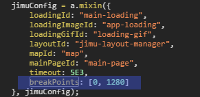
Article ID: 000015868
- ArcGIS Web AppBuilder
Get support with AI
Resolve your issue quickly with the Esri Support AI Chatbot.


Related Information
Discover more on this topic
Search for related information
Find training related to this topic
Explore ideas and give feedback
Get help from ArcGIS experts
Start chatting now