PROBLEM
Borders of grouped elements are not displayed in ArcGIS Dashboards dashboard view
Description
In ArcGIS Dashboards, when elements are grouped, the borders of each element are displayed during editing but hidden in the dashboard view. As a result, adjacent elements appear consecutively, reducing visual clarity.
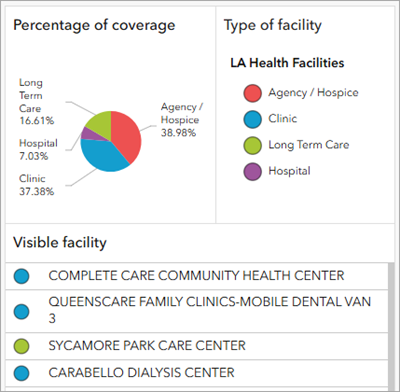
The image below shows this behavior in the dashboard with a group containing a pie chart, a map legend, and a list, with no borders separating the elements.

Cause
This is expected behavior in ArcGIS Dashboards. Groups are used to display multiple elements collectively, serving solely as containers for layout organization. Borders are not displayed in the dashboard view but are shown during editing to indicate element boundaries.
Solution or Workaround
As a workaround, to improve clarity and visually separate the elements within a group, enable the 'Allow element re-size' setting. This keeps subtle divider lines visible in the dashboard view, which act as a separator.
- Open the dashboard edit page.
- Enable the 'Allow element re-size' setting. Refer to ArcGIS Dashboards: View settings for more information.
- On the action bar, click View
 .
. - In the View pane, click the Settings tab.
- On the Settings tab, toggle Allow element re-size on.
- On the action bar, click View
- On the action bar, click Save
 > Save to save the changes.
 - In ArcGIS Dashboards, refresh the page to reflect the changes.
The borders separating each element within the group are displayed in the dashboard view.
Article ID: 000037929
- ArcGIS Dashboards
Get support with AI
Resolve your issue quickly with the Esri Support AI Chatbot.


Related Information
Discover more on this topic
Search for related information
Find training related to this topic
Explore ideas and give feedback
Get help from ArcGIS experts
Start chatting now