HOW TO
Create heat maps in ArcMap using the Density toolset
Summary
In ArcMap, heat maps are created to visualize the density of geographic data. For example, to determine the concentration of crime occurrences in a city, the incidents of forest fires due to slash-and-burn agriculture, or the distribution of endangered plant species across the equatorial rainforest.
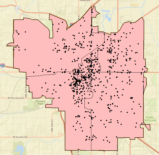
This article focuses on creating a heat map layer using the Density toolset. To understand density analysis, refer to ArcMap: Understanding density analysis. The image below shows crime occurrences in Lincoln, Nebraska. A heat map layer is created to show the spread and distribution of crime occurrences across the city.
Procedure
Use the Density toolset of the Spatial Analyst extension to create heat maps from points with either the Point Density tool or the Kernel Density tool, and from lines with either the Line Density tool or the Kernel Density tool.
Note:
If the Spatial Analyst extension is not available, it is possible to symbolize the data (points, lines, or polygons) to look like a heat map symbology by using graduated colors or symbols. Refer to ArcMap: Using graduated colors, ArcMap: Using graduated symbols, and ArcMap: About symbolizing layers to represent quantity for more information.
The Point Density tool
The Point Density tool calculates the magnitude per unit area from point features within a neighborhood. The sum value of points within a search area (neighborhood) is divided by the search area size to get each cell's density value. Refer to ArcMap: How Point Density works for more information.
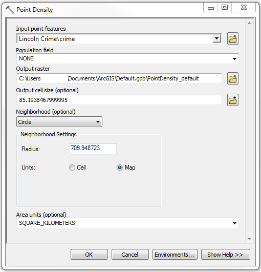
- Open ArcToolbox in ArcMap. Click Spatial Analyst Tools > Density > Point Density.
- Configure the parameters in the Point Density dialog box.
- Select the point layer to analyze in the Input point features field. In this example, it is Lincoln Crime\crime.
- Change the default values of the optional fields, if necessary. Click OK.
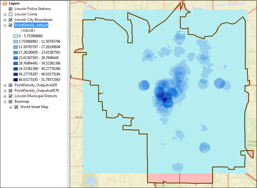
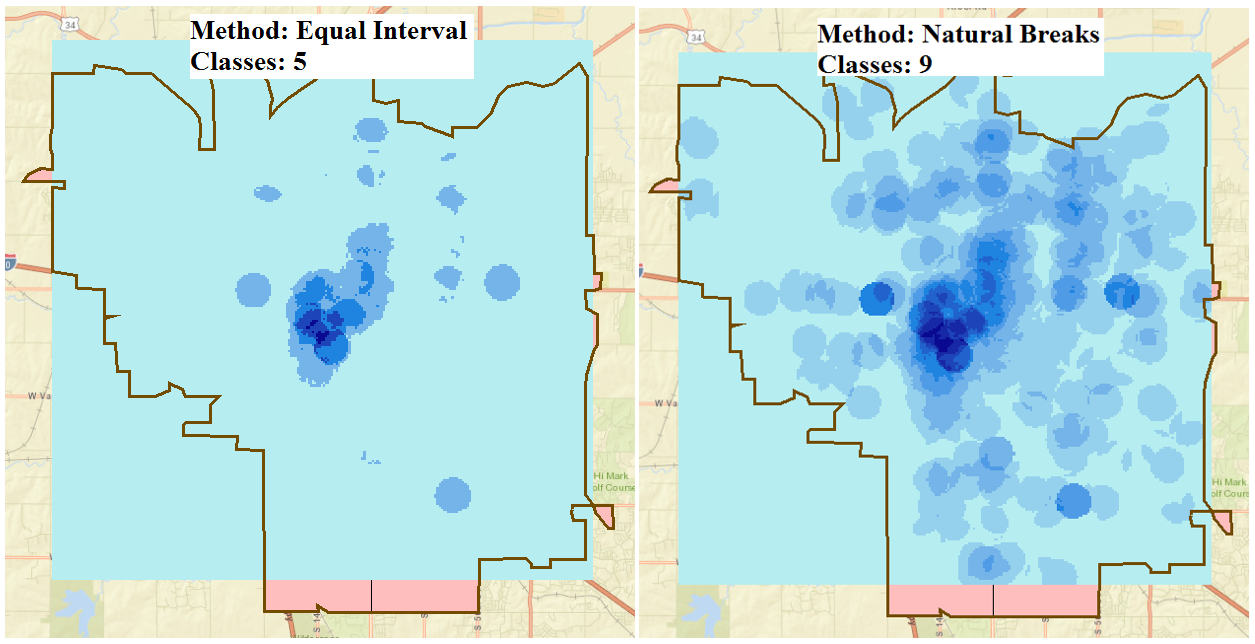
The image below shows the heat map layer created using the default settings of the Point Density tool. In this example, the default values include Population field: NONE; Output cell size: 85.19; Neighborhood: Circle; Neighborhood Settings: 709.948723 Map units; Area units: SQUARE_KILOMETERS. The symbology classification method is Equal Interval and is divided into nine classes.
Note: Optional parameters are configured to vary the output pattern as shown in the examples below. (a) Output cell size A larger cell size returns a more pixelated output. A smaller cell size returns a smoother output.(b) Neighborhood shape The field governs the shape of the area around each cell used to calculate the density value. The options are circular, annular (ring shape), rectangular, and wedge-like.
(c) Neighborhood settings A larger radius creates a more spread out pattern (a more generalized density raster), while a smaller radius creates a pattern concentrated towards the input (a more detailed density raster).
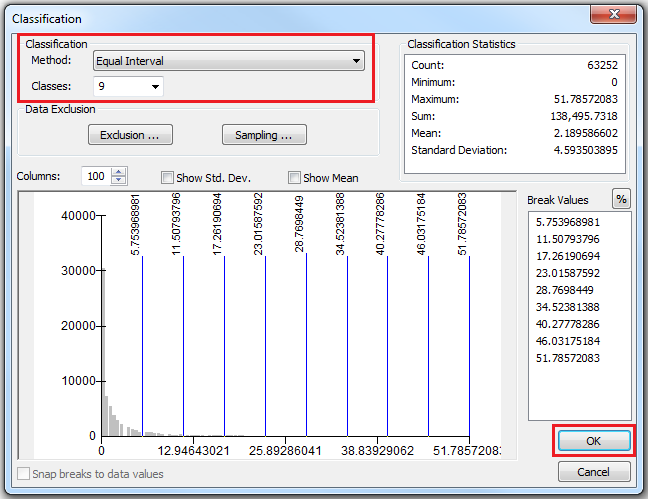
(d) Classify in terms of Classification Method and Classes Double-click the heat map layer to open the Layer Properties dialog box. Click Classify in the Symbology tab, and configure Classification Method and Classes. Click OK.
The Line Density tool
Use the Line Density tool to create a heat map layer on line features using the same concept as the Point Density tool. The Line Density tool calculates the magnitude per unit area from line features within the neighborhood around each cell. Refer to ArcMap: How Line Density works for more information.
The Kernel Density tool
The Kernel Density tool calculates the magnitude per unit area from point and line features using the kernel function. This function spreads the point location value outwards to each cell within the search radius. This creates a surface with the highest value at the point location and the lowest value at the search radius boundary. Refer to ArcMap: How Kernel Density works for more information.
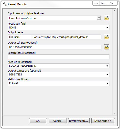
- In ArcMap, open ArcToolbox. Click Spatial Analyst Tools > Density > Kernel Density.
- In the Kernel Density dialog box, configure the parameters.
- Select the point layer to analyse for Input point features. In this example, it is Lincoln Crime\crime.
- Change the default values of the optional fields, if necessary. Click OK.
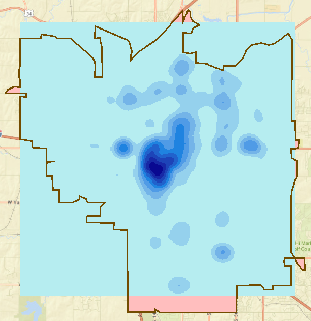
The image below shows the heat map layer created using the default settings of the Kernel Density tool. In this example, the default values include Population field: NONE; Output cell size: 85.19; Area units: SQUARE_KILOMETERS; Output values are: DENSITIES; Method: Planar. The symbology classification method is Equal Interval and is divided to nine classes.
Note: Optional parameters are configured to vary the output pattern as shown in the examples below. (a) Output cell size A larger cell size returns a more pixelated output. A smaller cell size returns a smoother output.(b) Search radius A larger radius creates a pattern that is spread out (a more generalized density raster), while a smaller radius creates a pattern concentrated towards the input (a more detailed density raster).
(c) Method The GEODESIC method takes into consideration the effect of curvature. This option is usually used with data near poles and across the International dateline. (d) Classify in terms of Classification Method and Classes Double-click the heat map layer to open the Layer Properties dialog box. Click Classify in the Symbology tab, and configure Classification Method and Classes. Click OK.
Article ID: 000021720
- ArcMap
Get support with AI
Resolve your issue quickly with the Esri Support AI Chatbot.


Related Information
Discover more on this topic
Search for related information
Find training related to this topic
Explore ideas and give feedback
Get help from ArcGIS experts
Start chatting now