HOW TO
Create heat maps in ArcGIS Pro using the Density toolset
Summary
Heat maps are commonly created to visualize the concentration patterns of geographic data using the density analysis of point or polyline data. A heat map uses color gradient to display and indicate the geographic density distribution across an area.
This article focuses on creating heat maps using the Density toolset of the Spatial Analyst extension in ArcGIS Pro. For more information on density analysis, refer to ArcGIS Pro: Understanding density analysis.
Procedure
The following is a detailed usage overview of the Density toolset to create heat maps in ArcGIS Pro using point or polyline data.
Note:
The Density toolset is only available with the Spatial Analyst license. To create heat maps without the Spatial Analyst extension, refer to ArcGIS Pro: Heat map symbology.
Kernel Density
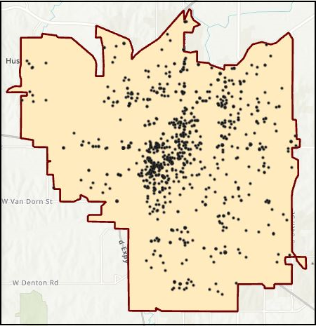
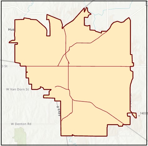
The Kernel Density tool calculates a magnitude-per-unit area from point or polyline features using a kernel function to fit a smoothly tapered surface to each point or polyline. Refer to ArcGIS Pro: How Kernel Density works for more information. In this example, a heat map is created using the point data layer of crime occurrences across Lincoln, Nebraska.
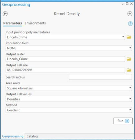
- In ArcGIS Pro, open the Kernel Density tool.
- Under Input point or polyline features, click the folder icon and navigate to the point data layer location. Select the point data layer to be analyzed, and click OK. In this example, the point data layer is Lincoln Crime.
Note:
The Kernel Density tool can be used to analyze point or polyline features.
- Under Output raster, click the folder icon and navigate to a folder location of the output raster. In the Output raster window, specify a Name for the output and click Save.
- Under Method, click the drop-down button select Geodesic (recommended method).
- Click Run.
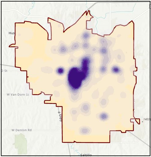
The image below shows a heat map created using the default settings of the Kernel Density tool. In this example, the default values are as follows: Population field: NONE; Output cell size: 85.19; Area units: Square kilometers; Output cell values: Densities. The default value of the Method field is Planar, but it is changed to Geodesic (the recommended method). The symbology classification method is Equal Interval and is divided to ten classes.
- Alternatively, configure the default values of the following parameters as desired, considering the outcome comparison listed below.
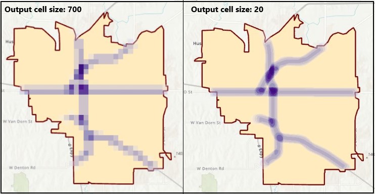
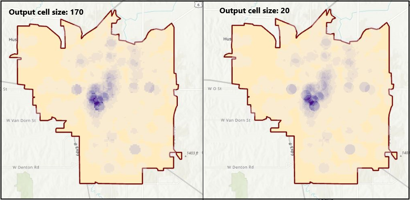
Output cell size
A larger cell size returns a more pixelated output. A smaller cell size returns a smoother output.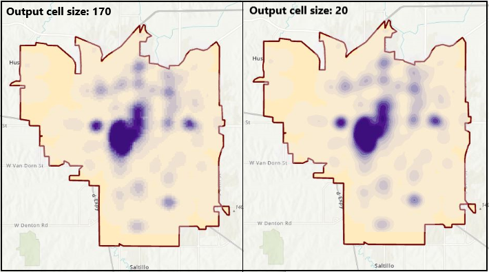
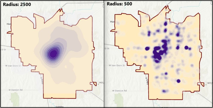
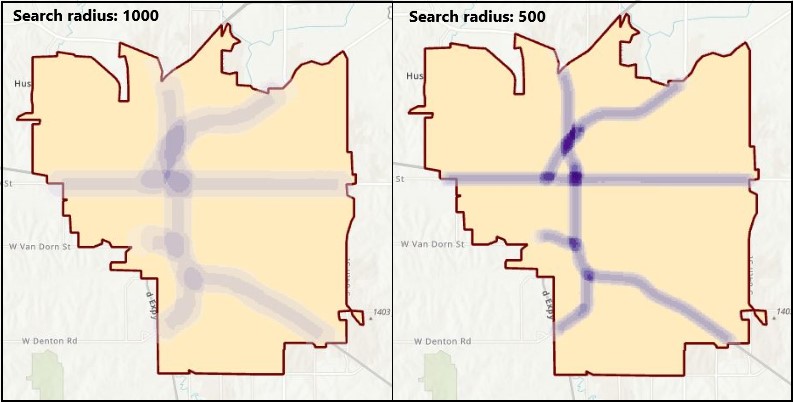
Search radius
A larger search radius creates a more spread out pattern (a more generalized density raster), while a smaller radius creates a pattern concentrated towards the input (a more detailed density raster).
Line Density
The Line Density tool calculates a magnitude-per-unit area from polyline features that fall within a radius around each cell. Refer to ArcGIS Pro: How Line Density works for more information.
In this example, a heat map is created using the polyline data of the major highways in Lincoln, Nebraska.
- In ArcGIS Pro, open the Line Density tool, and in the Line Density window, click Parameters.
- Under Input polyline features, click the folder icon and navigate to the polyline layer location. Select the polyline data layer to be analyzed, and click OK. In this example, the polyline data layer is Lincoln Highways.
- Under Output raster, click the folder icon and navigate to a folder location of the output raster. In the Output raster window, specify a Name for the output, and click Save.
- Click Run.
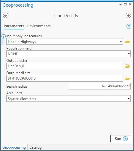
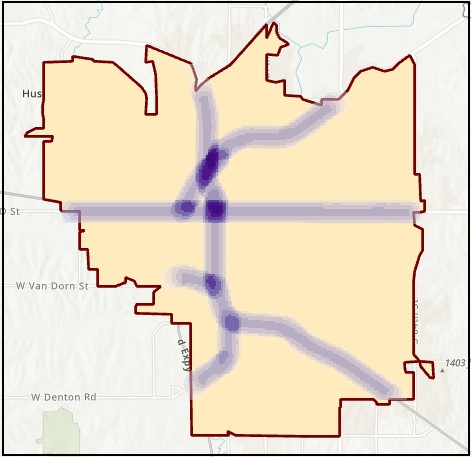
The image below shows a heat map created using the default settings of the Line Density tool. In this example, the default values are: Population field: NONE; Output cell size: 81.4188896; Search radius: 678.49; Area units: Square kilometers. The symbology classification method is Equal Interval and is divided to ten classes.
- Alternatively, configure the default values of the following parameters as desired, considering the outcome comparison listed below.
Output cell size
A larger cell size returns a more pixelated output. A smaller cell size returns a smoother output.
Search radius
A larger radius creates a more spread out pattern (a more generalized density raster), while a smaller radius creates a pattern concentrated towards the input (a more detailed density raster).
Point Density
The Point Density tool calculates a magnitude-per-unit area from point features that fall within a neighborhood around each cell. Refer to ArcGIS Pro: How Point Density works for more information.
In this example, a heat map is created using the same point data layer used in the Kernel Density tool.
- In ArcGIS Pro, open the Point Density tool, and in the Point Density window, click Parameters.
- Under Input point features, click the folder icon and navigate to the point data layer location. Select the point data layer to be analyzed, and click OK. In this example, the point data layer is Lincoln Crime.
- Under Output raster, click the folder icon and navigate to a folder location of the output raster. In the Output raster window, specify a Name for the output, and click Save.
- Click Run.
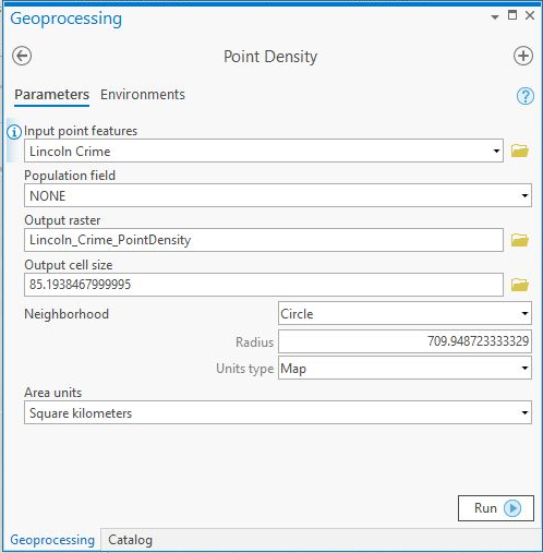
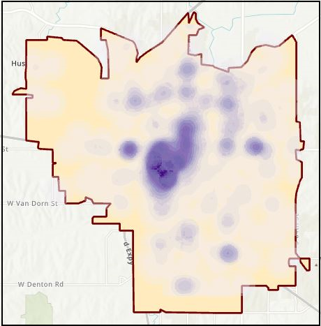
The image below shows the heat map layer created using the default values of the Point Density tool. In this example, the default values are: Population field: NONE; Output cell size: 85.19; Neighborhood: Circle; Radius: 709.948723; Units type: Map; Area units: Square kilometers. The symbology classification method is Equal Interval and is divided to ten classes.
- Alternatively, configure the default values of the following parameters as desired, considering the outcome comparison listed below.
Output cell size
A larger cell size returns a more pixelated output. A smaller cell size returns a smoother output.
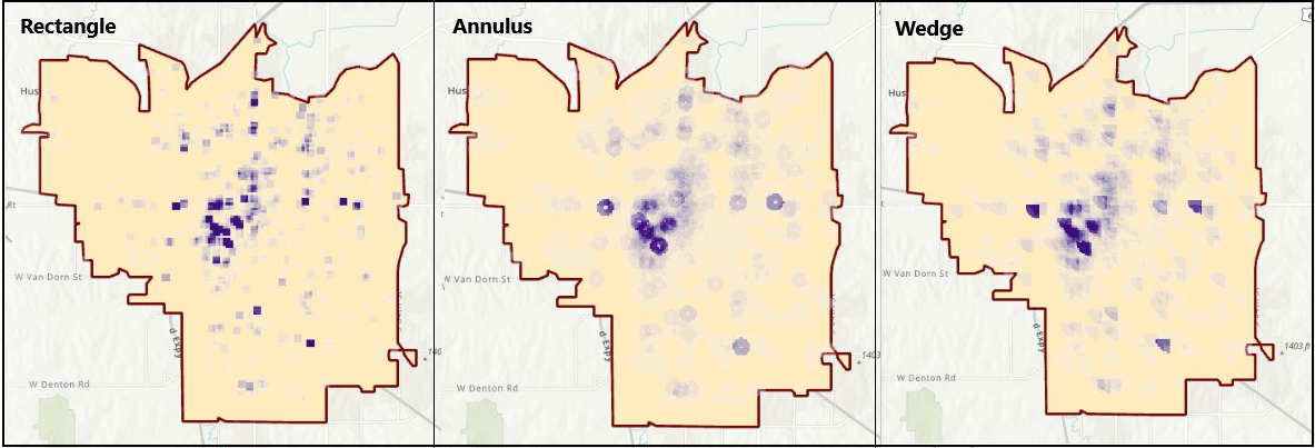
Neighborhood
This field governs the shape of the area around each cell used to calculate the density value. The options are Circle (circular), Rectangle (rectangular), Annulus (ring-like shape), and Wedge (wedge-like shape).
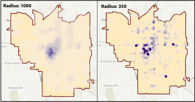
Radius
A larger radius creates a more spread out pattern (a more generalized density raster), while a smaller radius creates a pattern concentrated towards the input (a more detailed density raster).
Article ID: 000021710
- ArcGIS Pro
Get support with AI
Resolve your issue quickly with the Esri Support AI Chatbot.


Related Information
Discover more on this topic
Search for related information
Find training related to this topic
Explore ideas and give feedback
Get help from ArcGIS experts
Start chatting now