HOW TO
Create a grouped line chart in ArcGIS Dashboards
Summary
In ArcGIS Dashboards, grouped line charts can be added to a dashboard to display data with multiple categories on a single chart. The lines represent variables or categories and are distinguished by different colors on the chart.
This article describes the workflow to create a grouped line chart to compare the number of cases by month and year in ArcGIS Dashboards.
Procedure
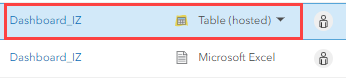
When adding data to ArcGIS Dashboards, ensure the data is published to ArcGIS Online as a hosted feature layer or table. Refer to ArcGIS Online: Publish hosted feature layers for instructions. In this example, the Excel file is published as a hosted table.
Note:
When creating serial charts with numeric or sequential data such as months, years, or values, ensure the field type is an integer. Otherwise, add a new column with an integer field type representing each category.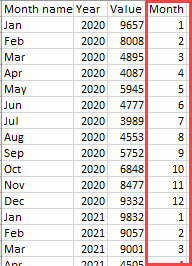
- Open ArcGIS Dashboards and create a dashboard. Refer to ArcGIS Dashboards: Create a dashboard for instructions.
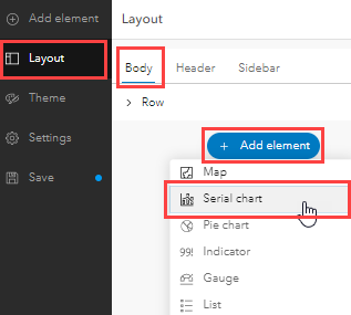
- On the dashboard toolbar, click the Layout panel and click Body.
- Click Add element and select Serial chart from the drop-down list.
- Click Browse all layers and select the desired hosted feature layer or table.
- Configure the serial chart in the Serial chart window.
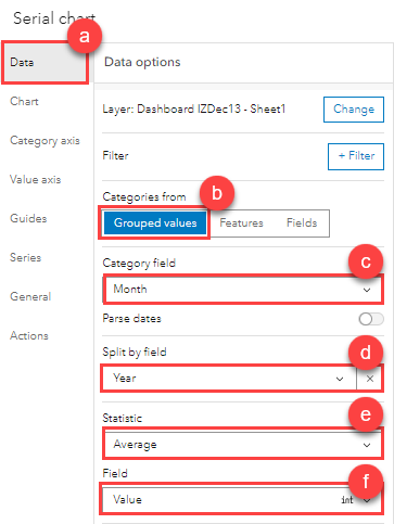
- Click the Data tab.
- For Categories from, select Grouped values.
- For Category field, click the drop-down list and select the field for the category axis (x-axis) of the chart. In this example, Month is selected.
- For Split by field, click the drop-down list and select the field to split the values into groups. In this example, Year is selected.
- For Statistic, click the drop-down list and select the type of statistic to be displayed. In this example, Average is selected.
- For Field, click the drop-down list and select the field for the value axis (y-axis) of the chart. In this example, Value is selected.
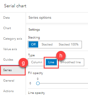
- Click the Series tab.
- For Type, click Line to display the chart as a line chart.
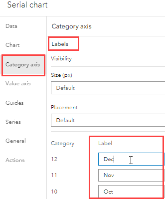
- Rename the category axis.
- In the Serial chart window, click the Category axis tab and expand Labels.
- Click Load categories and type the labels in the Label column for each Category. In this example, category 12 is labeled as Dec, category 11 is labeled as Nov, and so forth, according to the sequence of months in a year.
- Click Done to close the Serial chart window.
- Click Save on the dashboard toolbar to save the configurations.
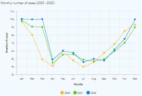
The image below displays the grouped line chart with the monthly and yearly trends in the number of cases.
Article ID: 000029000
- ArcGIS Online
- ArcGIS Dashboards
Get support with AI
Resolve your issue quickly with the Esri Support AI Chatbot.


Related Information
Discover more on this topic
Search for related information
Find training related to this topic
Explore ideas and give feedback
Get help from ArcGIS experts
Start chatting now