PROBLEM
The ArcGIS Dashboards serial chart category does not display labels for all data
Description
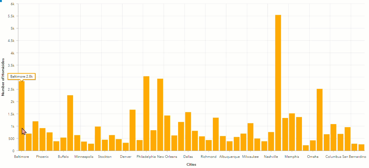
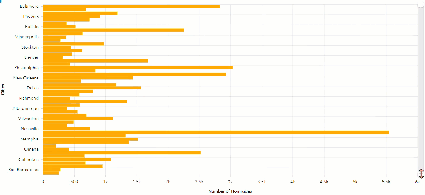
In ArcGIS Dashboards, a serial chart displays a series of data points along a horizontal (x) and a vertical (y) axis. However, in some instances, the serial chart category does not display the labels for all data. For example, the image below shows the number of homicides in each city in the US, but the labels for some cities are not displayed in the chart.
Cause
The issue occurs when there is insufficient space to display all the labels.
Solution or Workaround
Change the orientation of the axes
- Navigate to the ArcGIS Dashboards page. Select the desired dashboard, and click the Edit icon.
- In the Serial chart element, click the Configure button.
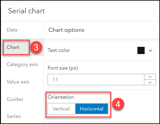
- In the Serial chart window, click Chart.
- Under Chart options, select the required orientation for Orientation. Click Done and save the dashboard.
Enable the Scrollbar function
- In the Serial chart element in ArcGIS Dashboards, click the Configure button.
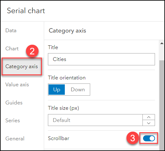
- In the Serial chart window, click Category axis.
- Under Category axis, expand Settings if needed. Toggle Scrollbar on.
- Click Done and save the dashboard. Slide the scrollbar to display the desired data.
Edit the size of the titles
- In the Serial chart element in ArcGIS Dashboards, click the Configure button.
- In the Serial chart window, click Category axis.
- Under Category axis, expand Settings if needed. Edit the value in the Title size (px) box.
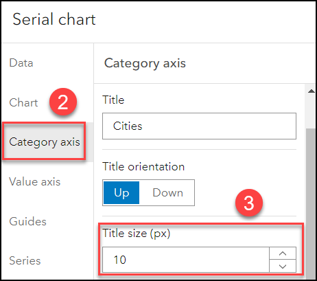
- Repeat Steps 2 through 3 for Value axis. Click Done and save the dashboard.
Edit the size of the labels
- In the Serial chart element in ArcGIS Dashboards, click the Configure button.
- In the Serial chart window, click Category axis.
- Under Category axis, expand Labels. Edit the value in the Size (px) box.
Note:
Alternatively, change the label placement type in Placement for Category axis.
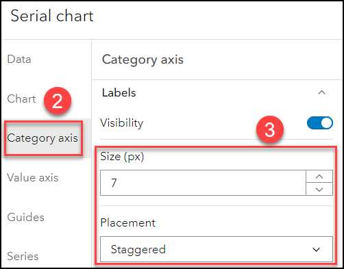
- Repeat Steps 2 through 3 for Value axis. Click Done and save the dashboard.
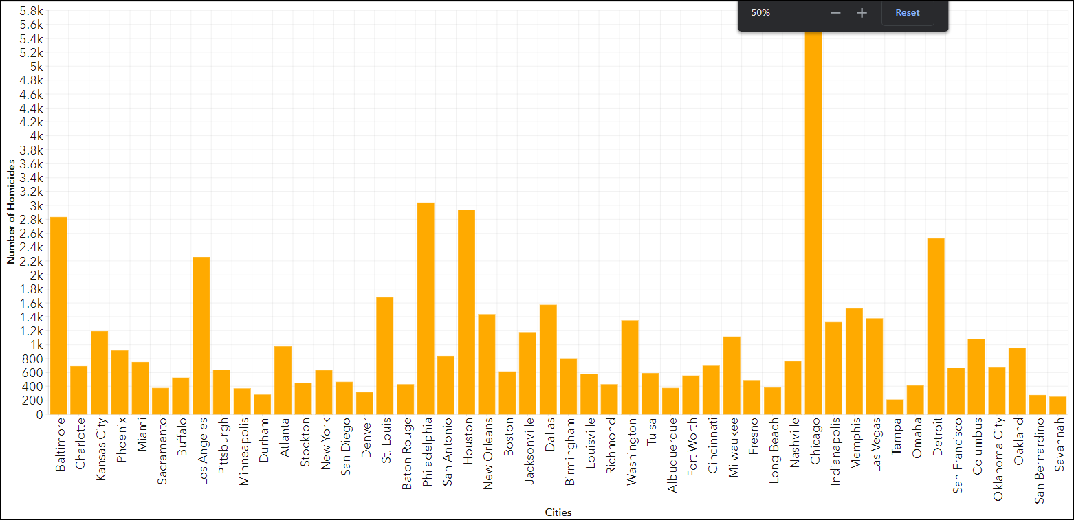
Reduce the zoom level of the web browser
Reduce the zoom level of the web browser to provide sufficient space for the dashboard.
The image below shows all the labels displayed in the dashboard when the browser is zoomed out to 50%.
Article ID: 000028953
- ArcGIS Dashboards
Receive notifications and find solutions for new or common issues
Get summarized answers and video solutions from our new AI chatbot.


Related Information
Discover more on this topic
Search for related information
Find training related to this topic
Explore ideas and give feedback
Get help from ArcGIS experts
Download the Esri Support App