HOW TO
Color code the background of the List element using Arcade in ArcGIS Dashboards
Summary
Arcade expressions can be used in ArcGIS Dashboards to customize how the data points appear in the list, indicator, and table elements. A data point can represent a feature or a summary statistic, depending on how the element is set up. A single data point represents a single feature when using features, and each data point represents the result of a statistic when it is used.
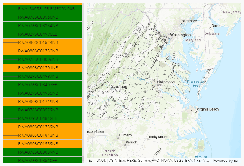
This article provides the steps to color code the background of the List element in ArcGIS Dashboards. In this example, the field values in the Project Status field are referenced to determine the background color for each field value in the Route Name field.
Procedure
- In the item details page, click Edit Dashboard to
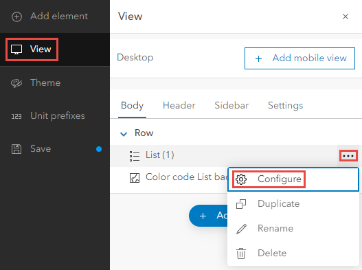
configure the dashboard. Click View on the dashboard toolbar, then the Options button next to the element. Click Configure.
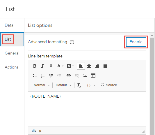
- Click List to open the List options menu, and click Enable.
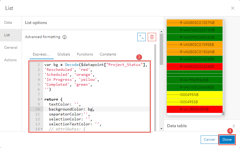
- Specify the following Arcade expression in the Expression window.
// Edit the desired color accordingly
var <variableName> = Decode($datapoint["<variable>"],
'<Field value 1>', 'red',
'<Field value 2>', 'orange',
'<Field value 3>', 'yellow',
'<Field value 4>', 'green',
'')

return {
  backgroundColor: <variableName>
}
- Click Done.
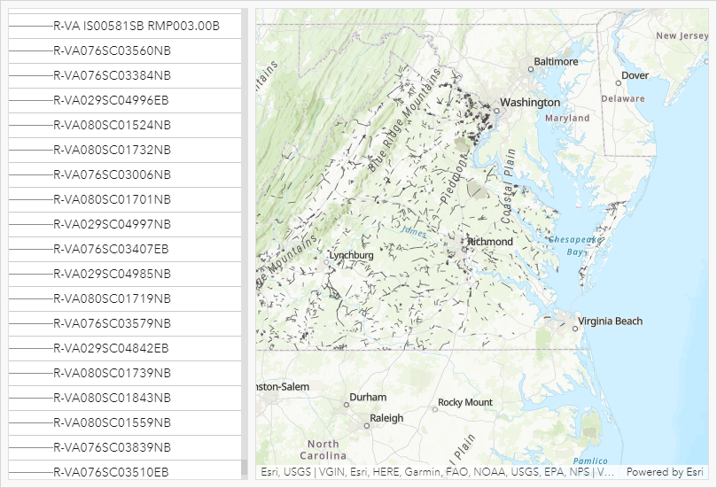
The image below shows the list element without the Arcade expression.
The image below shows the list element with the Arcade expression.
Article ID: 000027436
- ArcGIS Online
- ArcGIS Dashboards
Get help from ArcGIS experts
Start chatting now

