HOW TO
Create a quantitative bivariate map in ArcMap
Summary
A bivariate map portrays two variables, which represent two different phenomena simultaneously on a map. Bivariate maps enable users to visualize the spatial relationship between two variables, such as the relationship between population density and crime density, or between rainfall volume and forest density.
Procedure
The following workflows describe how to create a quantitative bivariate map in ArcMap. Depending on the suitability, select one of the options below:
Option A - Categories: Unique values, many fieldsThis option creates a layer category by combining up to three fields. The combination of these fields is symbolized by the color ramp to represent each unique combination.
- Right-click the layer of interest, and click Properties. The Layer Properties dialog box opens.
- Click the Symbology tab, and select Categories. Click the Unique values, many fields option.
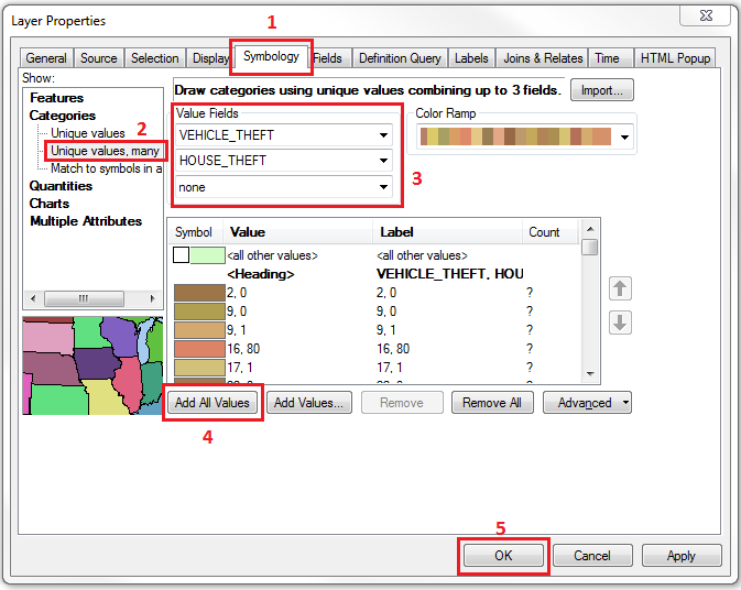
- For the Value Fields section, specify the combination of up to three different fields.
- For the Color Ramp section, select the best color combination to represent the combined data by clicking the drop-down button and selecting from the different color options available.
- Click the Add All Values button to insert all the combined data available. Alternatively, click the Add Values button to manually select the selected data combinations to put on map.
- Click OK.
Note:
For a large set of data consisting of many combinations, this method is not intuitive in portraying the relationship between different variables. There are a few alternatives to make the pattern more apparent. This includes, adding labels on the map to define the data, combining similar categories into one to produce a lesser number of combinations, or proceeding with another method that is more intuitive and representative of each variable.
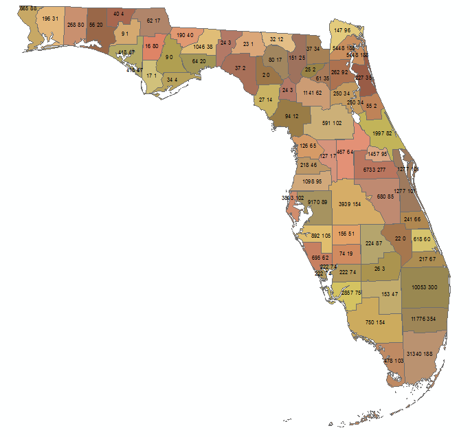
The image below shows a quantitative bivariate map using the Categories: Unique values, many fields option. Each unique color represents a different combination between two variables: the house theft and vehicle theft occurrences.
Option B - Quantities: Dot Density
Dot density represents data as point data on a map. Each dot represents a certain value or a certain size, as specified by users. The placement of these dots is random and is not representative of the feature locations. The occurrence density is represented by the proximity of these dots.
- Right-click the layer of interest, and click Properties. The Layer Properties dialog box opens.
- Click the Symbology tab, and select Quantities. Click the Dot density option.
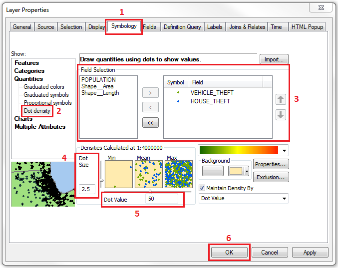
- For the Field Selection section, select all the fields to be represented on the map, and transfer the selections from the left to the right box by using the arrow button.
- Change the properties of the symbol in the Symbol Selector dialog box by double-clicking each dot symbol. Alternatively, click the color ramp drop-down button to select the best color combinations to represent different dot densities of different fields.
Note:
In differentiating between two or more variables, it is best to keep the colors in high contrast between one another.
- In the Densities field, specify the value for the Dot Size and the Dot Value to define the property of a dot.
Note:
Optional fields include changing the Background color, clicking the Properties button to select Dots placement and Masking option, and maintaining the appearance of dot densities.
- Click OK.
Note:
To maintain the density of the data, check the Maintain Density By check box and specify either to maintain by Dot Value (when zoom in, number of dots increase) or Dot Size (when zoom in, size of dots increase).
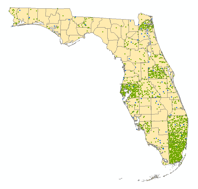
The image below shows a quantitative bivariate map using the Quantities: Dot Density option. Each dot represents 50 theft occurrences. The green dots represent the vehicle theft occurrences while the blue dots represent the house theft occurrences.
Option C - Charts: Pie; Bar/Column; Stacked
The usage of charts in ArcMap symbology is to portray quantitative representations of multiple variables on the same map.
Note:
To present a variable as part of a whole, use either the Pie or Stacked chart (check Fixed Length) option. To present relative amount between variables, use either the Bar/Column or Stacked chart (uncheck Fixed Length) option.
- Right-click the layer of interest, and click Properties. The Layer Properties dialog box opens.
- Click the Symbology tab, and select Charts. Select either a Pie, Bar/Column, or Stacked option.
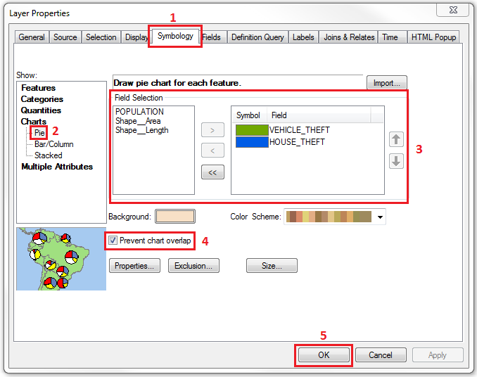
- For the Field Selection section, select all the fields to be represented on the map, and transfer the selections from the left to the right box by using the arrow button.
- Change the properties of the symbol in the Symbol Selector dialog box by double-clicking each dot symbol. Alternatively, click the color ramp drop-down button to select the best color combinations to represent different dot density of different fields.
- Prevent overlapping charts by checking the Prevent chart overlap check box.
Note:
Optional fields include changing the Background color, defining the Normalization field (for Bar/Column or Stacked charts), specifying the chart Properties, and determining the chart Size.
- Click OK.
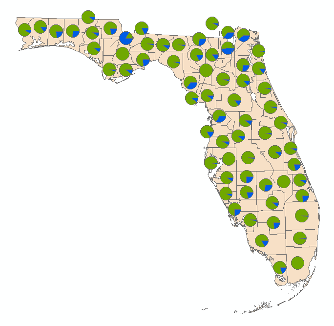
The image below shows a quantitative bivariate map using the Charts: Pie option. The green color portion represents the vehicle theft occurrences while the blue portion represents the house theft occurrences.
Option D - Multiple Attributes: Quantity by Category
This method allows users to represent specified categories by using combination of color ramp (first variable and/or second variable) and symbol markers (second variable) to portray two different variables.
- Right-click the layer of interest, and click Properties. The Layer Properties dialog box opens.
- Click the Symbology tab, and select Multiple Attributes.
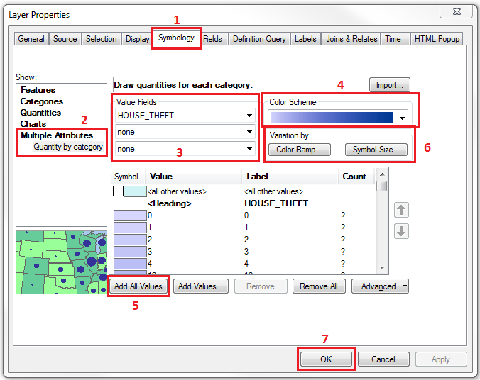
- For the Value Fields section, select up to three fields to be represented by the Color Scheme. The field or combination of fields is the first variable to be represented on the map.
- In the Color Scheme section, click the drop-down button and select a suitable color scheme.
- Click the Add All Values button to insert all the combined data available. Alternatively, click the Add Values button to manually select the data combinations to put on the map.
- To represent the secondary variable, click either the Color Ramp button or the Symbol Size button from the Variation by section. This opens a dialog box.
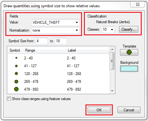
- In the Value field, select the second variable to represent on the map. Specify the Normalization field if necessary.
- Define the Classification section; select the number of classes, and click the Classify button to further modify the classification setting. Click OK.
- Click OK to close the Layer Properties dialog box.
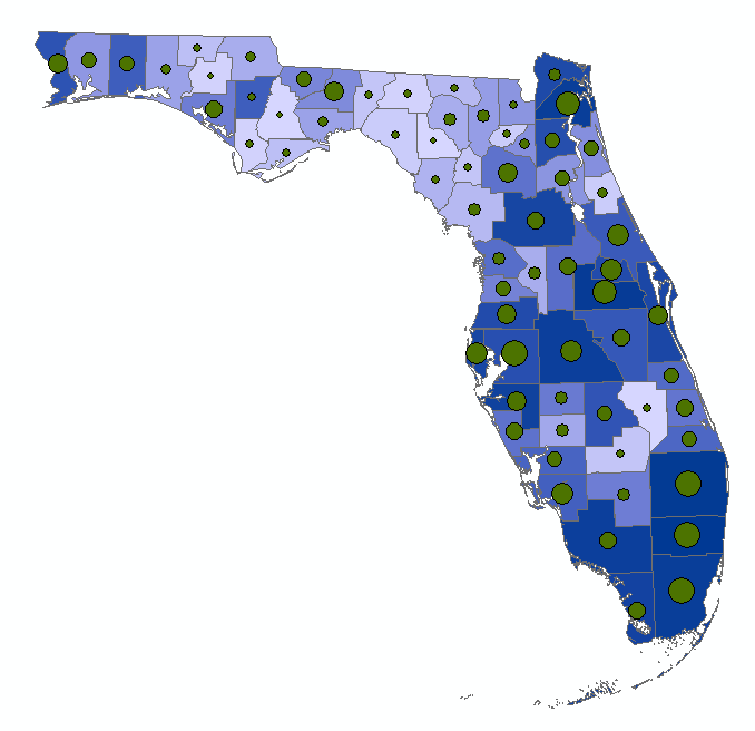
The image below shows a quantitative bivariate map using the Multiple Attributes: Quantity by Category option. Different hues of blue color represent the number of house theft occurrences (darker color represents higher number of occurrences), while different size of green dots represent the number of vehicle theft occurrences (larger dot represents higher number of occurrences).
Article ID:000018184
- ArcMap
Get help from ArcGIS experts
Download the Esri Support App
Related Information
Discover more on this topic
Search for related information
Find training related to this topic
Explore ideas and give feedback