HOW TO
Synchronize charts based on the selection in a chart using ArcGIS Experience Builder
Summary
Synchronizing charts allows the data displayed in multiple charts to be filtered simultaneously based on the chart’s category selected by the user when their data source is represented by the same layer.
Using the following workflow, when selecting a category in the main chart, the secondary synchronized chart displays only the unique values for that category.
Procedure
- Open ArcGIS Experience Builder and create a new experience.
- In the ArcGIS Experience Builder home page, click Create New.
- Click the Create button from the Blank fullscreen template.
- Add data to your experience.
- In the left pane, click the Data tab, and select Add data.
- Browse the content and select the desired data, and click the Done button on the lower right corner.
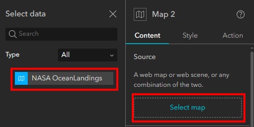
- Add a Map widget and connect it to the data.
- In the left pane, click the Insert tab.
- Choose the Map widget under the Map centric category and drag it over the canvas.
- In the right pane, with the Map widget selected, click Select map.
- Under the Select Data tab, choose a layer.
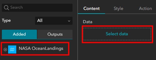
- Add two Chart widgets.
- In the left pane, click the Insert tab.
- Choose the Chart widget under the Data centric category and drag it over the canvas.
- On the right pane, for Chart, click Select data. The Select data pane opens.
- Under the Select data pane, choose the data.
-
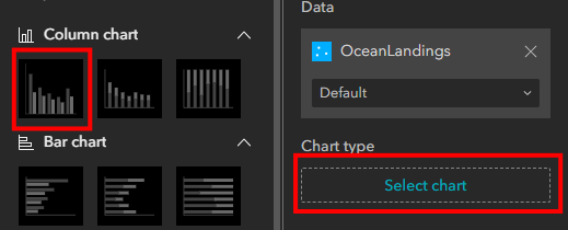
- In the Chart pane, click Select chart and pick the first template.
-
- In the Chart pane, under the Data tab, for Category field, choose a field to display in the chart.
- Repeat for the other Chart widget.
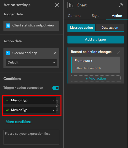
- Configure the main chart.
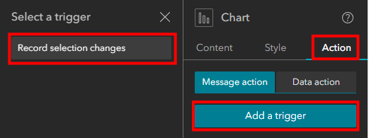
- Select the chart.
- On the Chart pane, click Action.
- Under Message action, click Add a trigger.
- In the Select a trigger pane, click Record selection changes, and choose the Framework as the Target, and select Filter data records.
Note:
Selecting 'Framework' will filter this layer across the application, including the second chart and the map. Selecting a Map widget as the target only filters the data in the map and the chart remains unfiltered.
-
- Click Select Data and select your data layer.
- Under the Conditions category, the same field must be selected for trigger and action to achieve the filtering.
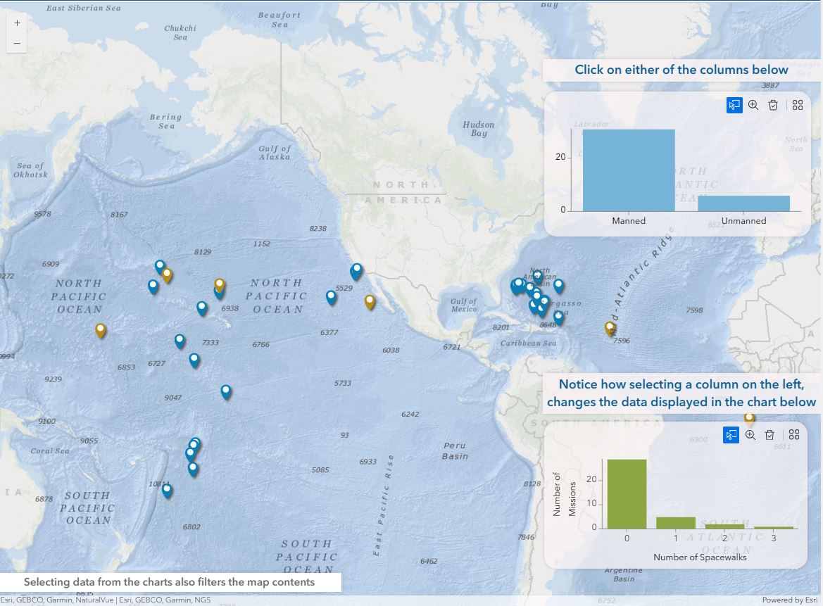
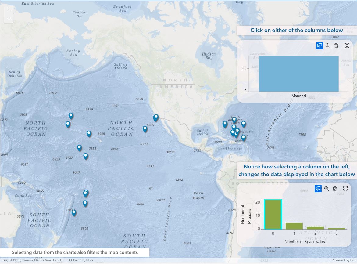
Now selecting a column on the main chart will filter the data for the entire framework, changing the data displayed by the Map widget and the other Chart widget.
The follwing image shows an example of an unfiltered map.
The next image shows an example with both selections applied, on the left and right charts.
Article ID: 000033870
- ArcGIS Experience Builder
Get support with AI
Resolve your issue quickly with the Esri Support AI Chatbot.


Discover more on this topic
Search for related information
Find training related to this topic
Explore ideas and give feedback
Get help from ArcGIS experts
Start chatting now