PROBLEM
Unable to export a side-by-side comparison infographic PDF report for all buffers in ArcGIS Business Analyst Web App
Description
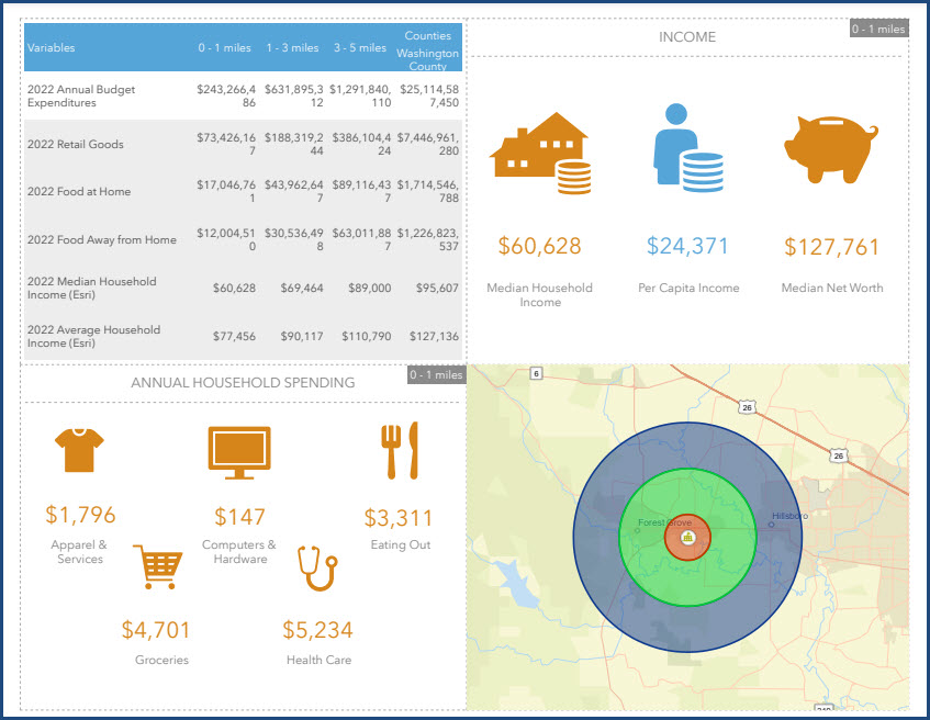
In ArcGIS Business Analyst Web App, when attempting to export an infographic PDF report for all buffers of a site, only one of the buffers' infographics is displayed in the report. As shown in the image below, exporting the infographic PDF report results in only one of the buffers' infographics with a radius of '0 - 1 miles' displayed in the panels.
Cause
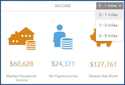
This is by design when a comparison table is added to a panel of an infographic template. Adding a comparison table to a panel causes the panel to display a drop-down menu of the buffers in the app, therefore allowing only one set of data from a buffer to be displayed and exported to an infographic PDF report at a time.
Solution or Workaround
Follow the workaround below to export a side-by-side comparison infographic PDF report for all buffers in ArcGIS Business Analyst Web App by deleting the comparison table and adding a table with variables in the infographic template.
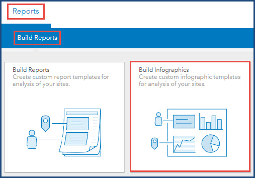
- Log in to ArcGIS Business Analyst Web App.
- On the Reports tab, click Build Reports > Build Infographics.
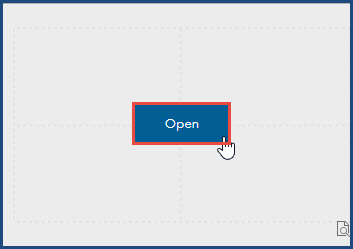
- Hover over the existing template and click Open.
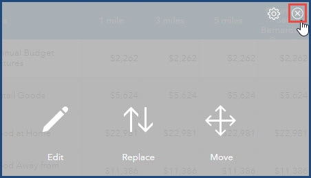
- In the infographic builder, hover over the comparison table element and click Remove panel.
- Add a table with variables to the panel. Refer to ArcGIS Business Analyst: Add a table with variables for instructions.
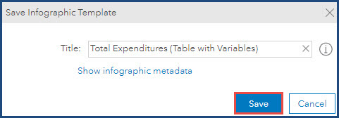
- Click Save.

- In the Save Infographic Template window, rename the template title if necessary and click Save. In this example, the template is saved as 'Total Expenditures (Tables with Variables)'.
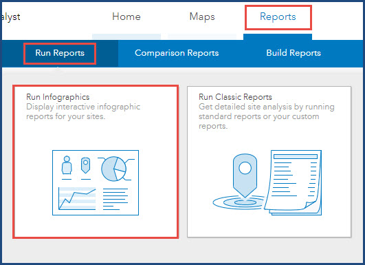
- On the Reports tab, click Run Reports > Run Infographics.
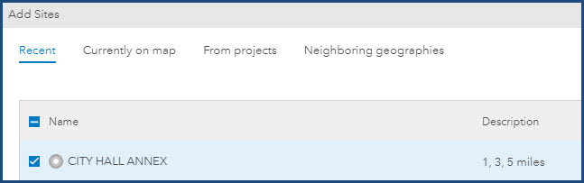
- Click Add sites. In the Add Sites window, select a site and click Apply. In this example, 'CITY HALL ANNEX' is selected.
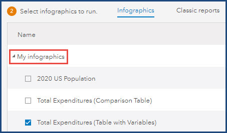
- Under Select infographics to run, expand My infographics, and select the custom infographics template. In this example, 'Total Expenditures (Table with Variables)' is selected.
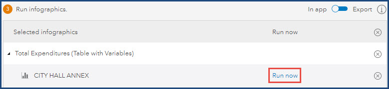
- In the Selected infographics pane, click Run now.
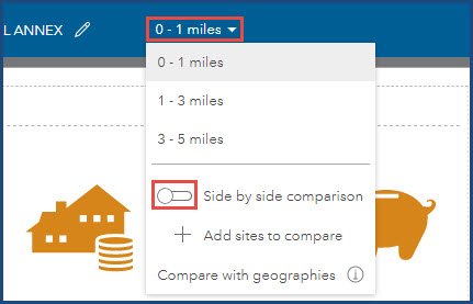
- Click the site details drop-down and toggle Side by side comparison on for a side-by-side comparison in the app.
- Click Export infographic
 on the top ribbon to export the infographic.
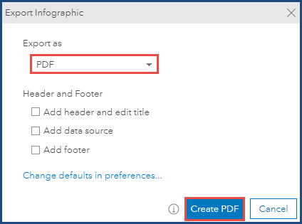
 - In the Export Infographic window, ensure Export as is set to PDF and click Create PDF to download the infographic PDF report.
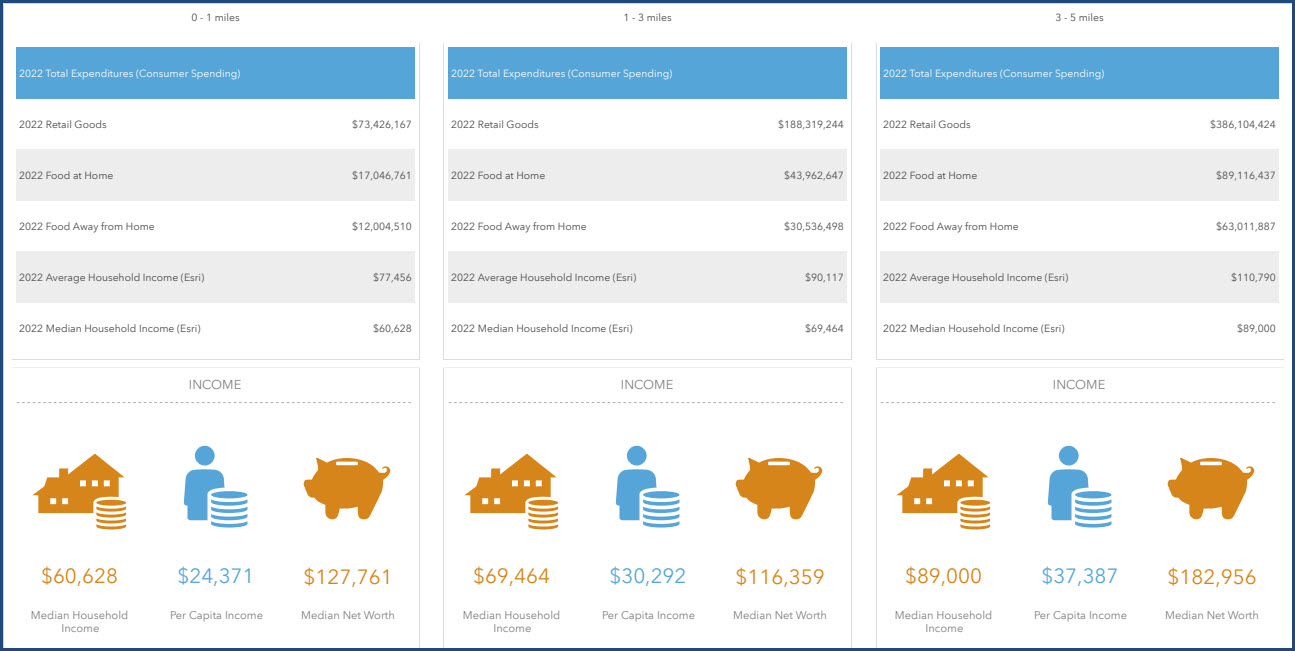
The image below demonstrates the exported PDF file with a side-by-side comparison infographic for all the buffers ('0 - 1 miles', '1 - 3 miles', and '3 - 5 miles').
Article ID: 000029129
- ArcGIS Business Analyst Web App
Get support with AI
Resolve your issue quickly with the Esri Support AI Chatbot.


Related Information
Discover more on this topic
Search for related information
Find training related to this topic
Explore ideas and give feedback
Get help from ArcGIS experts
Start chatting now