PROBLEM
The ArcGIS Dashboards serial chart does not display an exact data count
Description
Serial chart types, which include bar charts, line charts, and smooth lines, are elements used to display different data types. When hovering over a data point, the data count information is displayed. In some cases, the serial chart on ArcGIS Dashboards does not display the exact data count or value present in the attribute table, but displays an approximate value instead.
The image below demonstrates the problem; a bar chart displaying rounded integer values with a prefix instead of an exact data count.

Cause
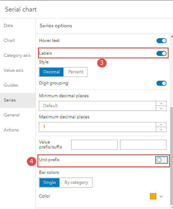
The 'Unit prefix' option is enabled on the Series tab of the Serial chart element.
Solution or Workaround
Disable the Unit prefix option on the Series tab
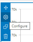
- On the dashboard's edit page, hover over the upper-left corner of the Serial chart element to display the menu, and select Configure.

- Click the Series tab to display the Series options pane.
- Under Settings, ensure Labels is toggled on.
- Toggle Unit prefix off.

- Click Done.
The bar chart below displays the exact data count instead of the rounded integer values with a prefix.

Article ID: 000023817
- ArcGIS Dashboards
Get help from ArcGIS experts
Start chatting now

