HOW TO
Create a stacked chart in ArcGIS Dashboards
Summary
Incorporating a serial chart element enables efficient visualization of one or more series of data points in ArcGIS Dashboards. Data series of the same type can be grouped, stacked, or 100% stacked on a chart. A stacked chart is particularly useful to visualize data points of subgroups with multiple categories stacked on top of one another.
This article provides the workflow for creating a stacked chart in ArcGIS Dashboards.
Procedure
- Create a dashboard. Refer to ArcGIS Dashboards: Create a dashboard for instructions.
Note:
Alternatively, in ArcGIS Dashboards, click Create dashboard, fill in the required sections, and click the Create dashboard button in the lower-right corner.
- In ArcGIS Dashboards, click the Add element
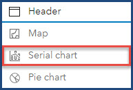
 button on the dashboard toolbar and select Serial chart.
- In the Select a layer window, click Browse all layers and select the desired layer.
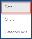
- In the Serial chart window, click the Data tab.
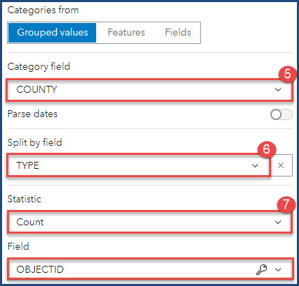
- For Category field, click the drop-down list and select the field for the category axis (x-axis) of the chart. In this example, COUNTY is selected.
- For Split by field, click the drop-down list and select the field for the value axis (y-axis) of the chart. In this example, TYPE is selected.
- For Statistic, select Count, and for Field, select OBJECTID.
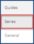
- Click the Series tab.
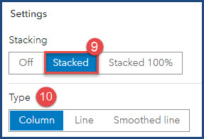
- For Stacking, select Stacked.
- For Type, select either Column, Line, or Smoothed Line to represent the data. In this example, Column is selected.
- Click Done.
- Click Save
 > Save to save the stacked chart in the dashboard.

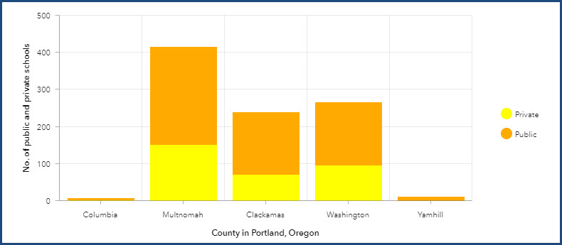
The example below shows the stacked chart for the number of public and private schools in five counties in Portland, Oregon. The numbers of public and private schools are placed on top of each other to represent the division of each type of school in each county.
Article ID: 000028939
- ArcGIS Dashboards
Get help from ArcGIS experts
Start chatting now

