HOW TO
Configure the header of a web experience for different screen sizes in ArcGIS Experience Builder
Summary
In ArcGIS Experience Builder, header layouts can be modified to effectively display web experiences on various devices such as mobile phones, tabs, or desktops, in which the screen sizes are small, medium, and large. The header layouts can be modified to fit the screen size to optimize the user experience when viewing on different devices.
This article describes the workflow to modify header layouts for small, medium, and large screen sizes for a web experience in ArcGIS Experience Builder.
Procedure
- Open the ArcGIS Experience Builder web experience.
Note:
Certain full-screen app templates use a header created with a Fixed Panel widget instead of the Header setting from the page. If this is the case, refer to Step 2 to enable the header to configure it.
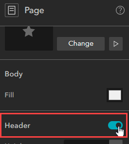
- On the Page panel, enable the Header option, if necessary.
- On the top ribbon, click the screen button to edit the page. In this example, the medium screen page for medium screen devices is configured.
- On the canvas, next to the header, click Custom to modify the header for medium screen devices.
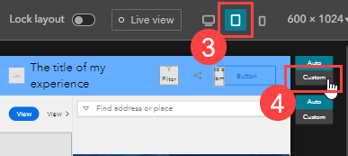
Note:
When Auto is selected, the header layouts are synchronized for all screen sizes.
- Click OK when prompted through the Are you sure you want to enable it? window.
- Hover over the canvas header and click Edit header to configure the header layout.

- Add and connect widgets to the header layout as desired. Refer to ArcGIS Experience Builder: Add and connect widgets for more information.
- To remove a widget from the current screen size, click the widget and click the Move to the pending list
 button. In this example, the Print widget is moved to the pending list as it is unnecessary to be displayed on medium screen devices.
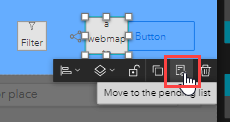
Note:
Deleting a widget removes the widget from all screen sizes. Moving the widgets to the pending list hides the widgets from the current screen and they can be added back to the canvas from the Pending tab on the Insert widget panel.
- Arrange the widgets accordingly to proportionately fit medium screen devices.
- On the top ribbon, click the other screen sizes and repeat Steps 4 through 7 to modify the header layout.
- Click Save
 to save the configurations.
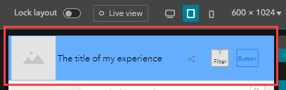
The image below displays the header layouts for the medium screen size.
Article ID: 000028481
- ArcGIS Experience Builder
Get support with AI
Resolve your issue quickly with the Esri Support AI Chatbot.


Related Information
Discover more on this topic
Search for related information
Find training related to this topic
Explore ideas and give feedback
Get help from ArcGIS experts
Start chatting now