HOW TO
Configure charts that display negative and positive values simultaneously in a web app and ArcGIS Online Map Viewer
Summary
Some data yield both negative and positive values. For example, the annual profit-deficit data of a company, the annual temperature data of a country with four seasons, and the amount of radioactive isotopes inside fossils. Visually representing these data helps the audience understand the relationship between multiple variables and deduce the conclusions.
Procedure
Choose one of the options below to configure charts that display both negative and positive values in a web app and ArcGIS Online Map Viewer.
ArcGIS Dashboards
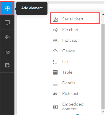
In ArcGIS Dashboards, select Serial chart from the drop-down list to visualize negative and positive values simultaneously.
Note:
A pie chart is not suitable to display both positive and negative values because the total does not add up to 100%.
ArcGIS Web AppBuilder
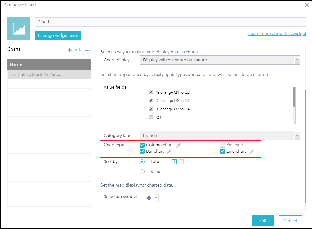
In ArcGIS Web AppBuilder, add and configure the Chart widget. Check any of the Column chart, Bar chart, or Line chart checkboxes from the Chart type field to visualize both negative and positive values on the chart.
Note:
In ArcGIS Web AppBuilder, a pie chart can be used to display negative values, but not a combination of positive and negative values.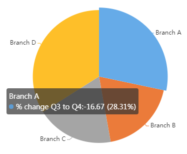
ArcGIS Online Map Viewer
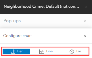
In ArcGIS Online Map Viewer, refer to ArcGIS Blog: Pop-ups: chart element essentials to create charts in the pop-up display. In the Configure chart pane, select any of the Bar, Line, or Pie options to display both positive and negative values on the chart.
Note:
In ArcGIS Online Map Viewer, using a pie chart to represent both negative values does not display any value on the chart.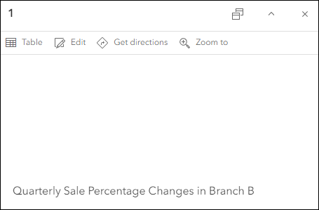
Article ID: 000020856
- ArcGIS Web AppBuilder
- ArcGIS Online
- ArcGIS Dashboards
Get help from ArcGIS experts
Start chatting now

